
Case study - Hotel booking website
Assignment to redesign a hotel booking site. Task given by the UX Design Institute for the Professional UX Design Diploma. The client and brief are fictional. Background information on tourist accommodation comes from the Swiss Federal Statistical Office (BFS - accommodation statistics).
Timeline: 12 months in part-time | October 2021-Oktober 2022
Role: UX Researcher / UX Designer
Table of content
3. Design
3.1. User flow
3.2. Sketches
5. Validation - coming soon
6. Documentation - coming soon
7. Conclusion and lessons learned for further projects
8. Sources
The Client - Candela Hotel
The 4-star hotel "Candela" based in Zurich is a business and spa hotel.
It was newly built in 2018, has 56 rooms, 3 conference halls of different sizes and 5 seminar rooms with state-of-the-art infrastructure.
The spa area with indoor pool, saunas, steam baths and treatment rooms offers a variety of relaxation options, as well as a diverse range of services with top trained masseurs and beauticians.
-
Tourist accommodation from January to August 2022 in Switzerland
According to the Federal Statistical Office (BFS - accommodation statistics), the hotel industry in Switzerland recorded rising figures. From January to August 2022, a total of 25.9 million overnight stays were recorded. This is +34.2% or +6.6 million more overnight stays compared to the same period in the previous year.
The slump in 2020 has not yet been compensated for. In 2019, 39.6 million overnight stays were recorded, in the following year only 23.7 million - which meant a slump of 40.15%.
Tourist accommodation from January to August 2022 in the Canton of Zurich
It certainly is true that overnight stays in the canton of Zurich from January to August 2022 increased by +124.9% or +1.8 million in comparison to the corresponding period of the previous year, with a total of 3.3 million (BFS - Cantonal overview).
Brief
The owners of the "Candela" hotel would like to further increase their occupancy figures. Besides marketing measures, they decide to improve either the website or the native app booking process. The aim of the improvement is customers to complete more bookings.
The hotel has no website or app traffic data or other kind of metrics to set SMART goals or to or measure the return on investment.
figure 1 | moodboard Candela Hotel / photos from unsplashed
0. Where I started
figure 2 | 7 steps of the design proces
In order to find out how to increase the number of successfully completed bookings, I needed to get an overview of how customers book rooms on hotel sites and what devices they use. As I had no specialist knowledge of hotel booking processes, best practice and patterns, I used online surveys and competitive benchmarks as introductory research and usability tests for a deeper look at the problem (1).
-
Afterwards, I will bring all the research results together, sort them and visualise the user's journey through the website or app in two different methods (2). On the one hand on the emotional level in a customer journey map (2) - this allows to highlight pain points - and on the other hand on the interactive level in a user flow (3). This shows the necessary successive interactions of the user from the search to the completion of the booking. This path is then sketched out in a paper prototype (low-fidelity prototype) (3), the designed concept is tested and the flow optimised. Then an interactive prototype (mid-fidelity prototype) can be created (4). This prototype shows the necessary building blocks, such as screen layout, information architecture, navigation, copy and labels, and allows basic interactions that are tested by users (5). In the regular design process, steps 3,4 and 5 are repeated again and again until a version is produced that represents the Minimum Viable Product or rather a Minimum Viable Solution (Patton 2015). This version is converted into wireframes, annotated (6) and passed on to the developers.
1. Research
Research goals for online survey, usability test and competitive benchmark
With the help of triangulation, which means using 2 or more research methods at the same time, I get a more precise picture of the problems that arise. These can then be identified as patterns in the analysis phase. Next, these patterns are rewritten into assumptions, which then need to be tested and validated.
With the survey I want to find out:
what goals the users are pursuing
in which context they use the site
what pain points users have
what platform they use for booking
The online survey also shows me self-reported data.
The usability test will:
provide deeper insight into the pain points
give an insight into real world behaviour
and with the competitive benchmark would like to explore
how competitors solve the problems,
what conventions exist,
whether these conventions are applied
by trying to put myself in the shoes of the user and be empathetic, to understand the problems they have when using the website.
1.1. Online survey
Summary of the online survey results
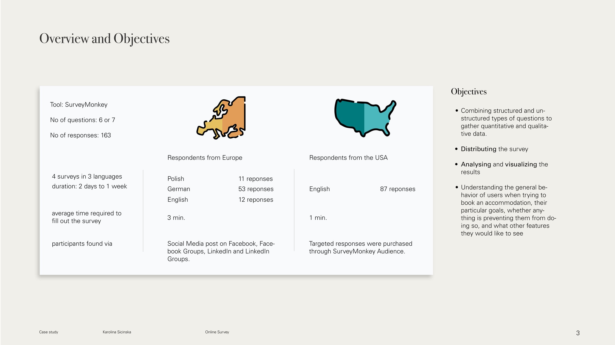
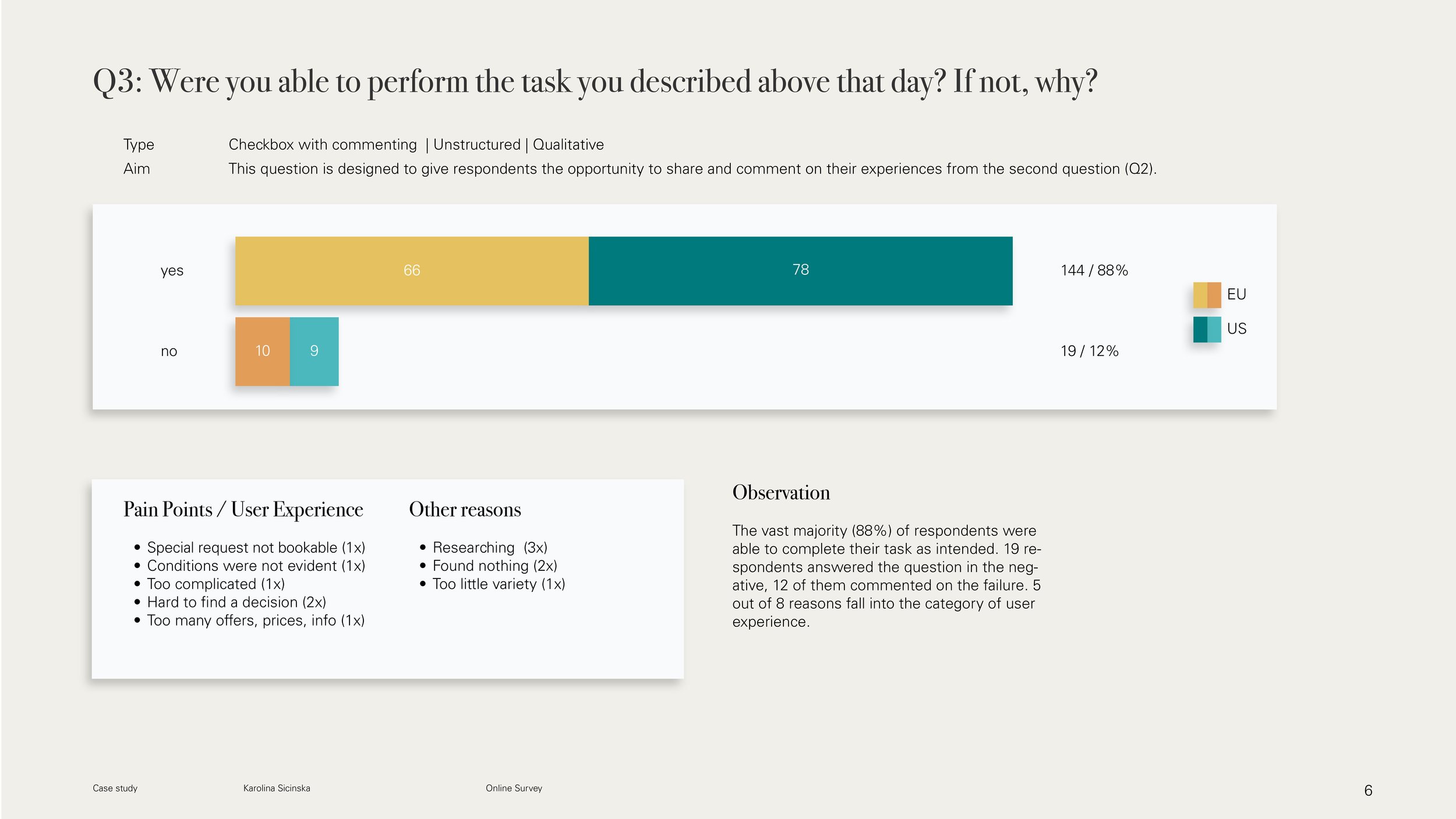
A total of 163 participants were surveyed (87 from the USA, 76 from Europe). The vast majority (88%) of respondents were able to complete their task as intended. 19 out of 163 participants could not complete their task, 12 of them gave reasons for the failing:
it was too complicated to book
it was hard to find a decision / there were too many offers, prices and information
there was too little variety / participants have not found anything suitable
booking conditions were not evident
special request was not bookable
participants have only been searching
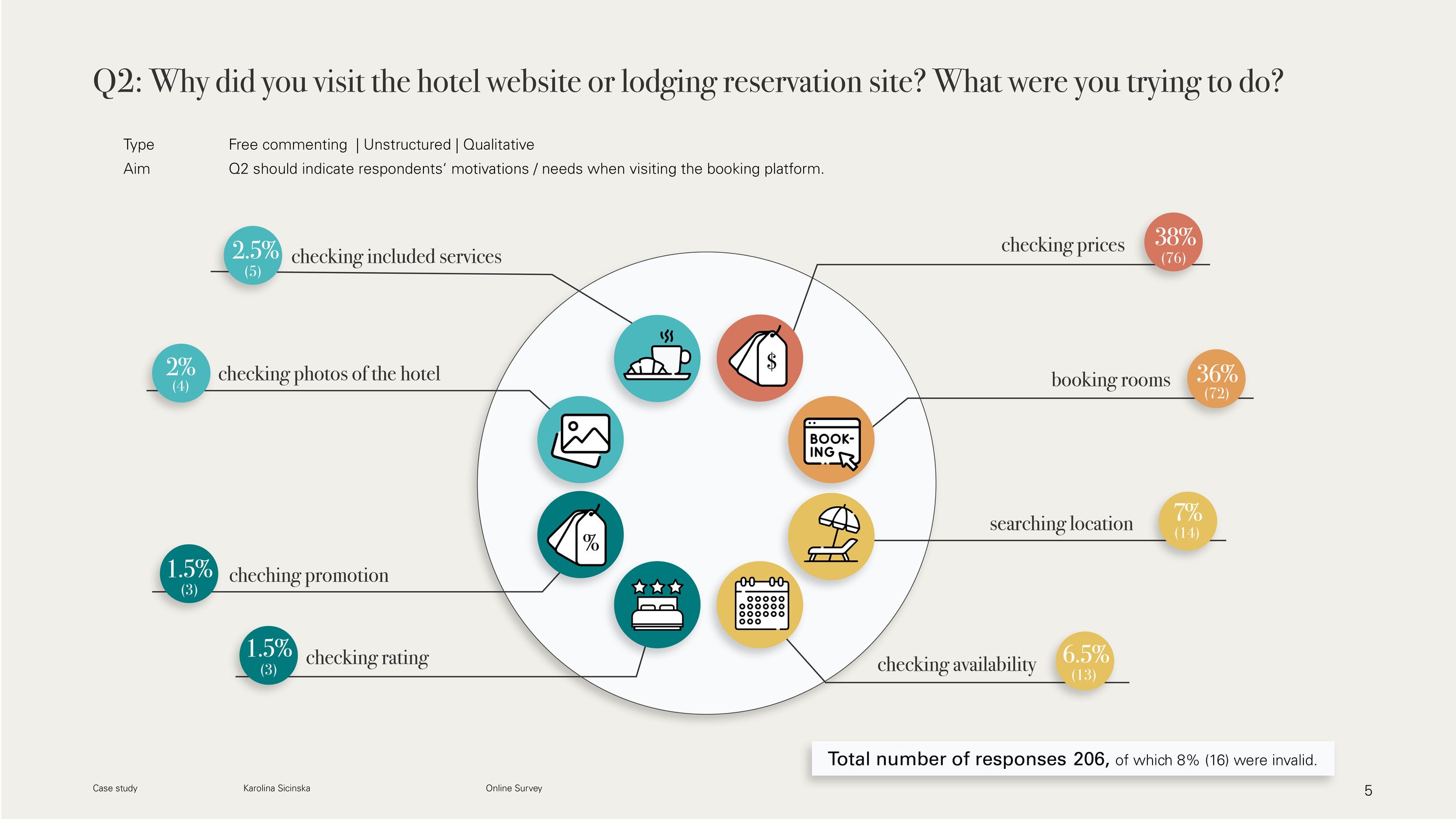
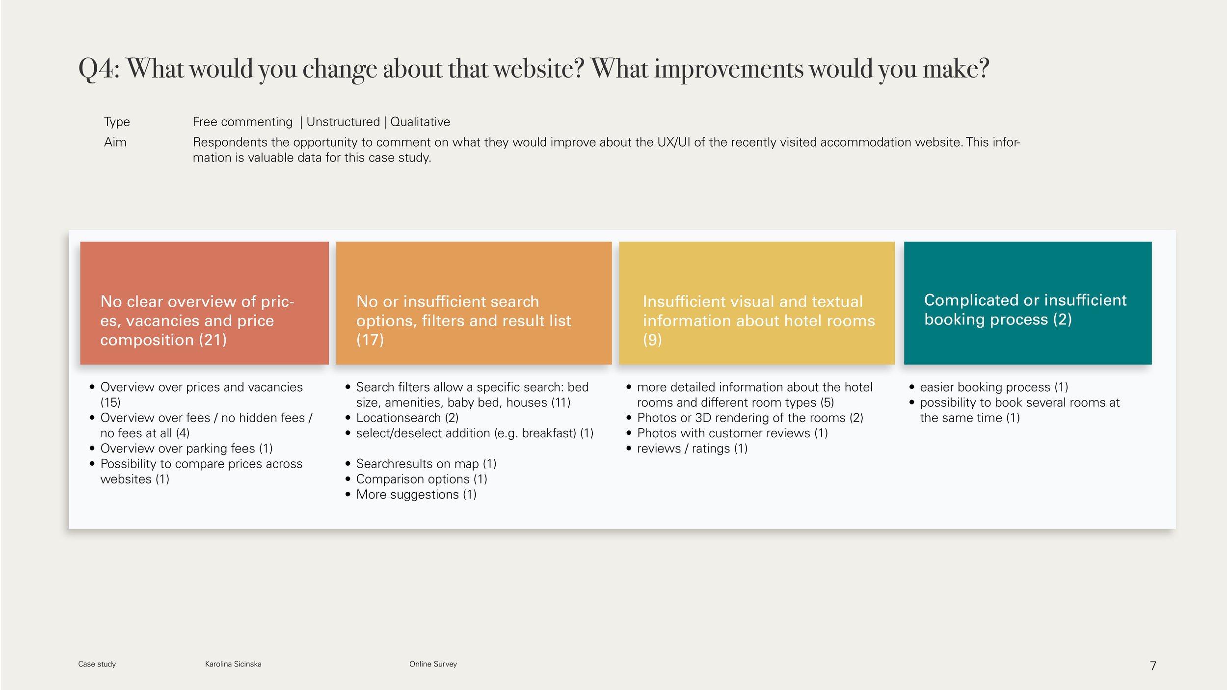
These and other issues became clearer when participants were allowed to comment freely on what changes or improvements they would like to see to the booking site they visited. The following four categories stood out (for detailed breakdown see p.7 and p.8 online survey results .pdf):
No clear overview of prices, vacancies and price composition
No or insufficient search options, filters and result list
insufficient visual and textual information about hotel rooms
complicated or insufficient booking process
When asked how many and which devices are used for booking, 81% (132) of the 163 surveyed households answered, that they use one device to book hotel rooms, 19% (31) use 2 or more devices.
In Europe, mainly desktop PC/Mac (27 households) or the combination of desktop PC/Mac and smartphones (15 households) are used for bookings. In the US, however, the majority (52 households) use smartphones for booking. Of these, 9 use a combination of smartphone and desktop PC/Mac.
After presenting the results to the client, they decided to concentrate on European customers first, so that the booking process on the website should be improved.
As a result, the subsequent research, competitive benchmark and usability testing tasks focused on hotel websites.
“I usually start my search on mobile because I‘m just casually looking [...]. When I‘m serious about booking, I assuming I‘ll have to enter information and credit card info and know it will be easy to do that on a laptop.”
1.2. Usability test and note-taking
-
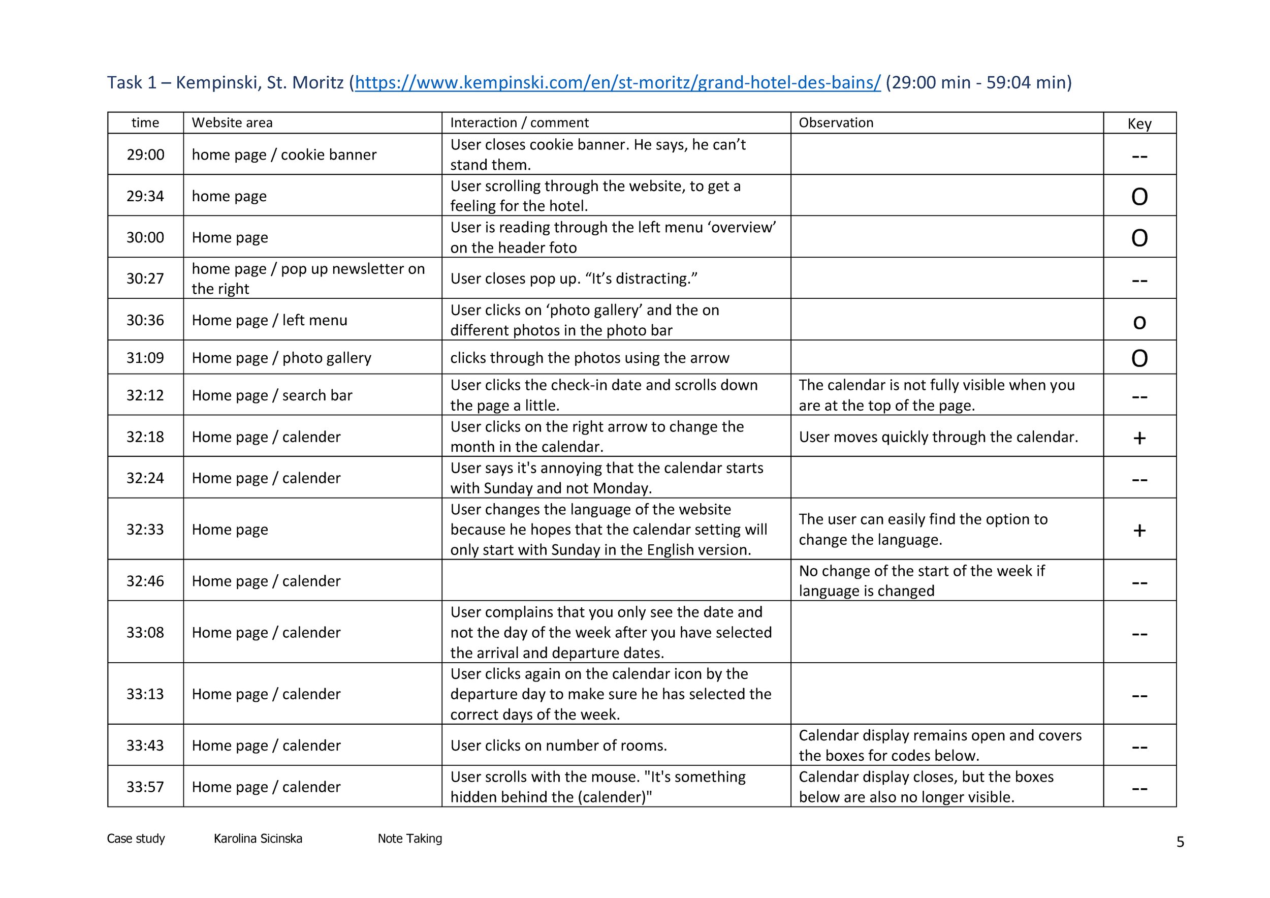
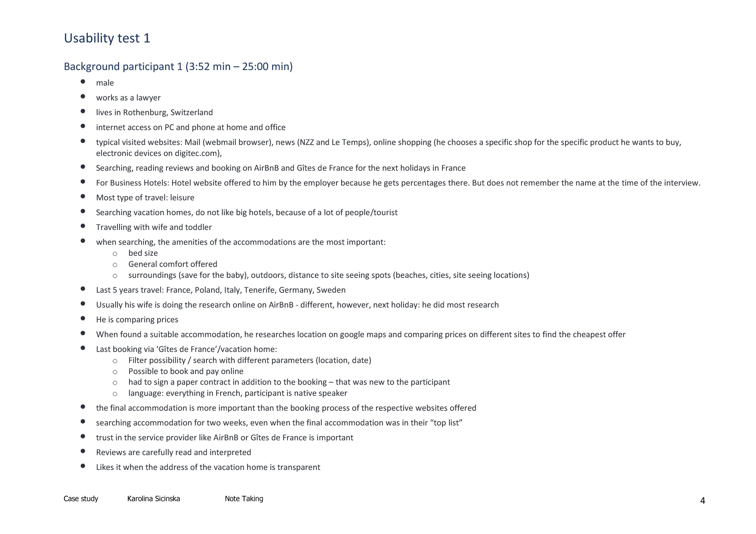
Four usability tests were carried out - two by the UX Design Institute (UXDI), two by me. For all of them, notes were taken and the results evaluated.
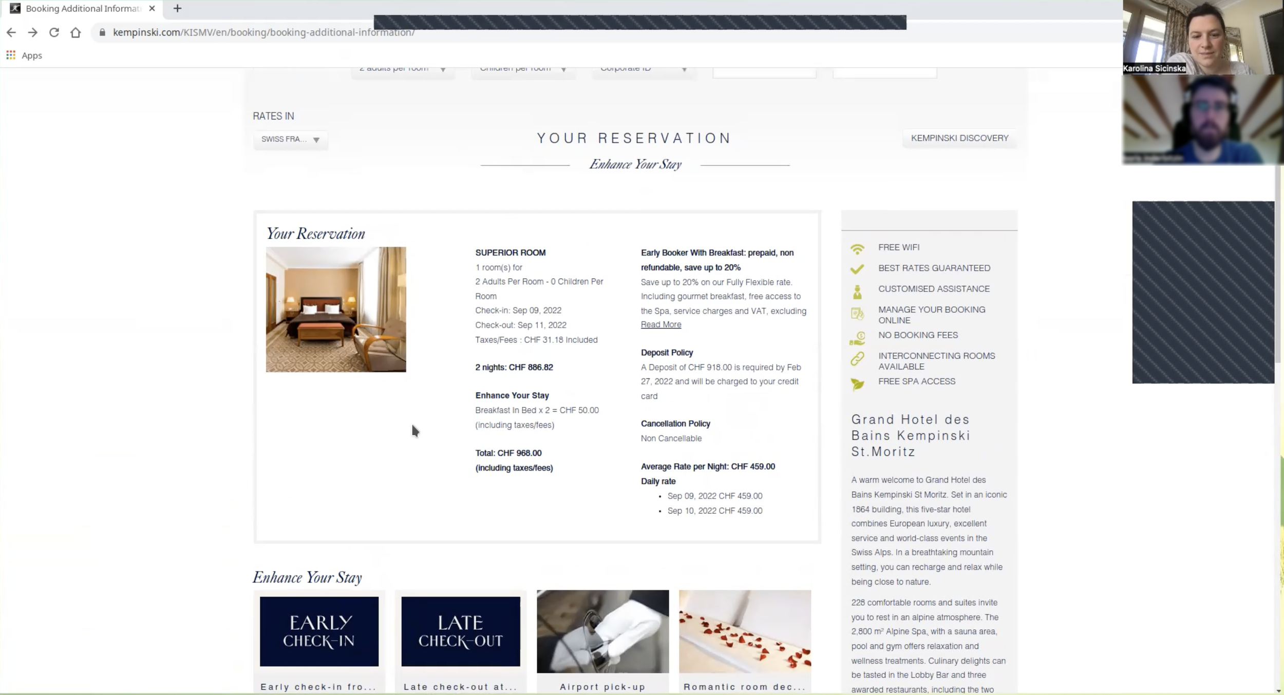
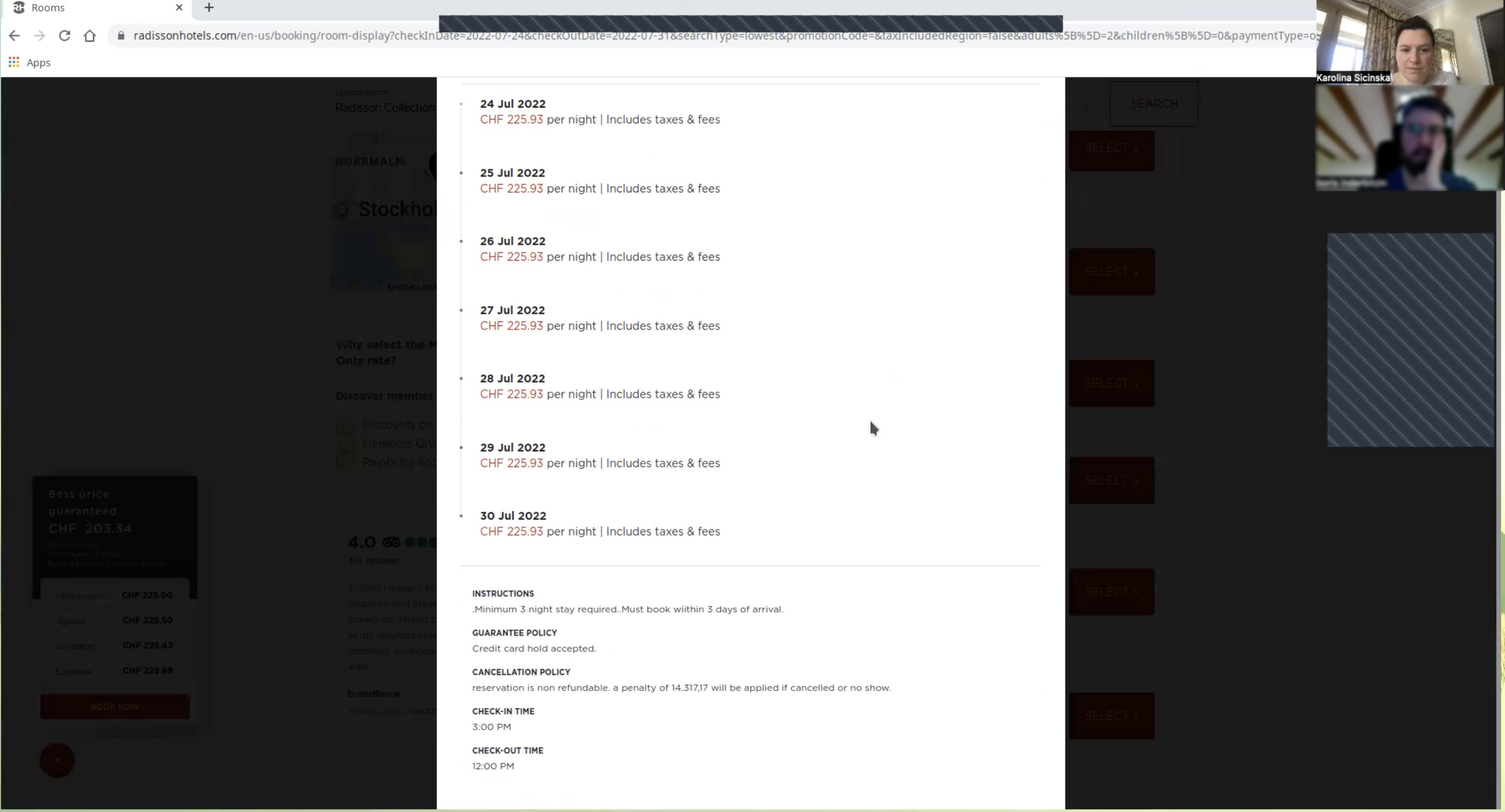
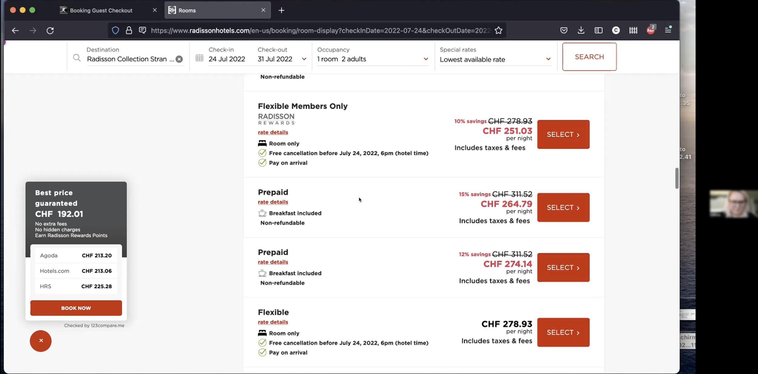
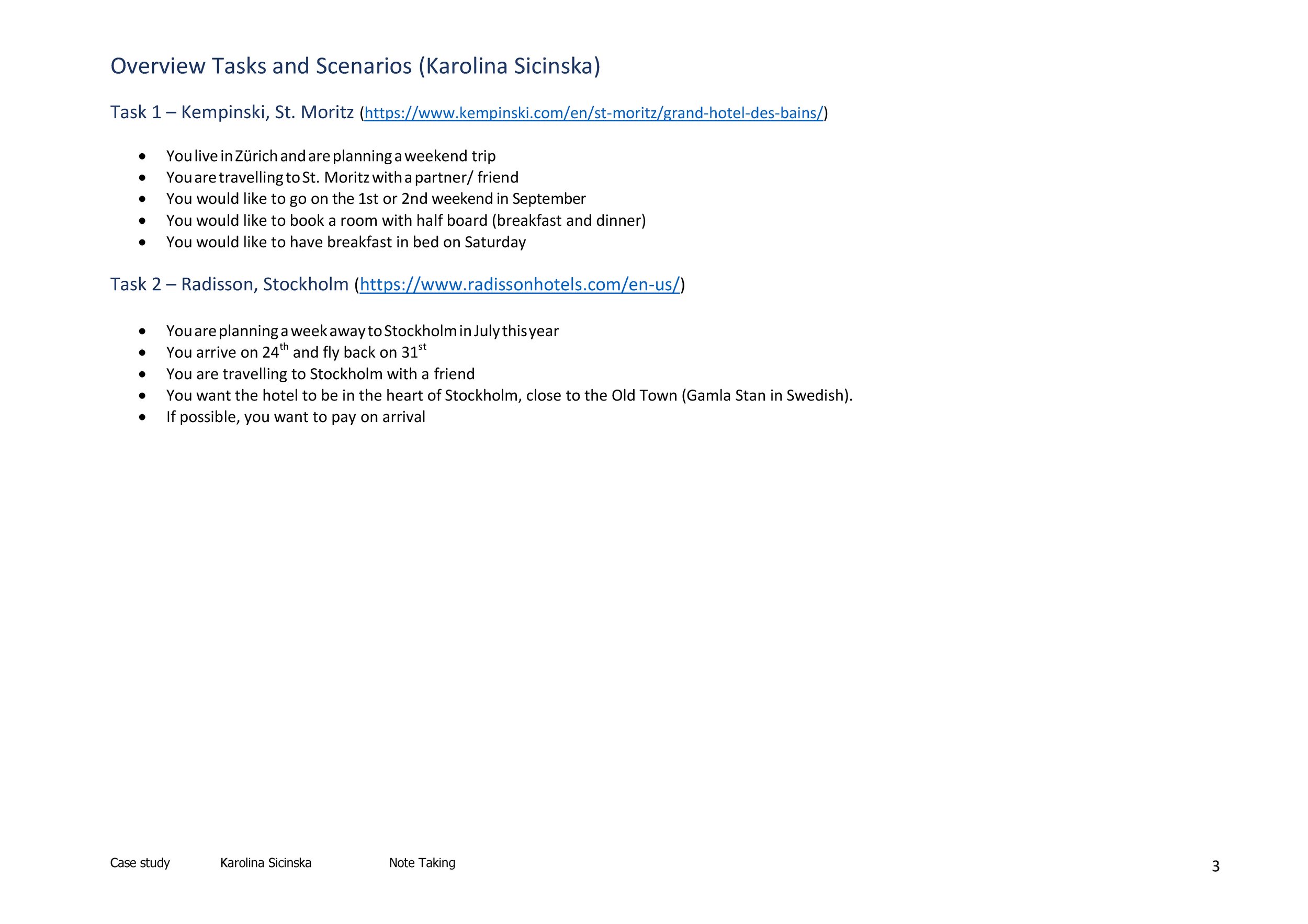
The UXDI tested the websites of Barcelo and The Doyle Collection. I had two participants test the websites of the Kempinski Grand Hotel des Bains in St. Moritz and Radisson in Stockholm.
Each test participant was asked to book a room for several nights, for him/herself and a partner or friend. At least one meal and one extra should be added to the booking.
All tests took place remotely via zoom and were recorded. With the help of my script, I guided the participants through the test. This contained the procedure with tasks and questions for the users to perform and answer respectively. My main goal was to ensure that the user felt comfortable to share their thoughts.
First, I explained the structure and how the session would work. I asked some general questions and questions about the experience of booking hotel accommodation. Then I asked them to complete tasks on the hotel booking websites mentioned above. -
After each usability test I watched the recordings and wrote down detailed notes. In addition to what the user said and did, I also noted what their goals, behaviour and context were. The notes table contains the time, the area of the website on which the interaction took place, in another column the interaction is described or a comment by the participant is written down, next to it I captured my observation and finally I rated the interaction as positive, negative or neutral, so that I can quickly find it again in the document later.
Findings and user quotes
Already now some statements in the usability test and online survey are congruent, whereby the usability test shows further background. Here are some results and quotes from the users:
search options, filters and result list
Search function and results must be displayed clearly and simply.
Clearly and consistently plan how to deal with entries in search fields. Does the user have to click a confirmation or not.
Filter function must offer more options than just number of people and date. For example, number of beds, other room features
The number of results displayed should be reconsidered or reduced by a filter function.
“Reservation of the actual room, was unpleasant. There were so many price options. It is too much, not transparent enough.”
“It took me some time to understand the difference between the 13 different options.”
overview of prices, vacancies and price composition
Clearly communicate what is included in the price per night. (Breakfast included or not / free cancellation / etc.)
Clear communication of what is included in the room. (Towels / cleaning of the room / bathrobes etc.).
Clear price presentation/price breakdown. Pricing is not transparent enough.
“Honestly, at this point, I would just like be able to choose ‘flexible’ but still have like the room overview before going directly to the booking process.”
visual and textual information about hotel rooms
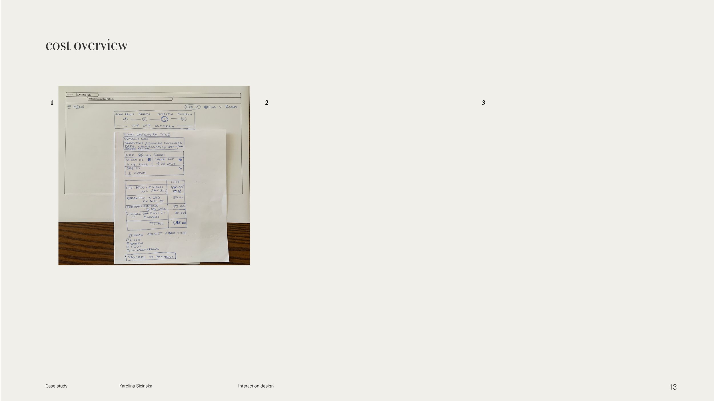
The newly added package 'breakfast in bed' is not immediately visible in the cost overview.
Explanation of room types and bed sizes and how they differ from each other.
“It wants me to already book the room. I would have preferred to see overall option of the room before booking.”
booking process overall
Placement and arrangement of add-ons must be considered.
Undo and return options should be visible.
Booking button or button for further process should be clearly visible and not hidden in a tab.
Consider image and video file sizes because of the speed of the Internet.
Photos should give the user a feeling about their stay. This means that they should be able to imagine the size of the room, but there should also be photographs with ambience.
Timing of pop-up should be chosen so that the user is not disturbed in the selection or reading process.
“Can I go back? Looks like I can’t go back here.”
“It feels a bit aggressive, because I have to ‘book’ right away and I just can’t have an overview of the options that I would get with that particular room.”


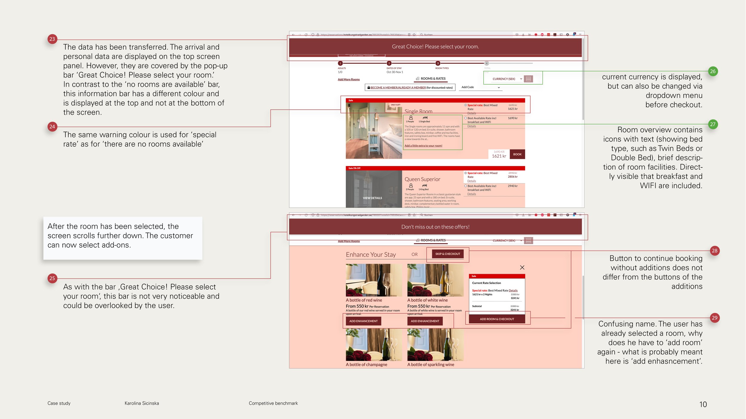
1.3. Competitive benchmark
Simultaneously with the ongoing usability testing, I conducted competitve benchmark. The main goal of this competitive benchmark was to understand the competitive landscape of hotel room booking websites and to identify and try to understand when users might experience problems during the booking process.
-
I chose 3 individual hotels of different categories and AirBnB. Through this, I hoped to identify cross-category conventions and common patterns, as well as best practices during the hotel booking process on a website. I wanted to identify errors in heuristics and describe the overall feel of the booking experience.
The following websites have been compared:
King‘s Garden (Sweden)
Kempkinski St. Moritz (Switzerland)
Park Inn by Radisson Stockholm Hammarby Sjostad (Sweden)
AirBnB
The analysis was limited to the following pages/aspects:
Homepage/Landing page
Search and selection of date and room
Entering customer details
Genereal findings
The most important function of the hotel page is the presentation of the hotel and the possibility to book a room.
The booking should request the most important details of the trip without unnecessary information.
The booking process should be intuitive and short for the user, but may be divided into several steps. If the booking is made in several steps, a process bar should illustrate which step the user is in.
The representation of the hotel, on the other hand, is best done via atmospheric photos or videos. However, the loading time must be taken into account here.
Distinctions between the main page and the booking page may exist, but should not confuse the user.
There should be a clear summary of offers and benefits, this can be done by icons and precise short texts.
Add-ons should be clearly displayed and easy to select and deselect.
Important information should be highlighted in color.
Separating the different information areas increases visual clarity.
Patterns
Selected arrival and departure date is highlighted
Fast booking access available
Plenty of white space and air to breathe
Logo serves as ‘back to homepage’


2. Analysis
2.1. Affinity diagram
-
After the research phase was finished, I started to enter all raw data in Miro on post-its (phase 1).
In the 2nd phase, I grouped the data sets into rough groups. In the 3rd phase, I re-evaluated and reorganised the first sorting by first arranging the small groups and noticed that two huge groups "appearance" and "functions" remained. So I specified these more, and worked out a "group title vocabulary".
Finally (4th phase), I sorted the groups by topic (...) on the one hand and as a sequence on the other, this was the preparation for the user flow (2.3).
With the data from the triangulation, patterns and frequently occurring problems at different points in the booking process then became visible in the affinity diagram. Therefore, improvements must be made during the following steps:
Check availability via the search bar: Select the arrival and departure dates and the number of guests.
Room results summary
Possibility of filtering different room criteria
Selecting and adding add-ons/extras
Cost overview
Payment
navigation through the page / returning
Deletion of intimidation tactics
My hypothesis is that if all these points are simplified and presented more clearly, then more people will successfully complete the booking process.
figure 4 | Extract from the affinity diagram
2.2. Customer Journey Map
Customer journey maps (CTJ) illustrate what the customer experiences when interacting with a company, service or software. They contain goals, behaviours, context, pain points, opportunities and comments. For my CTJ, I have taken the user's touchpoints with the hotel booking website of my competitive benchmark, as well as the prioterisation of patterns of the affinity diagram.
Key findings
figure 5 | Customer journey map
3. Design
3.1. User flow
User flow and customer journey map are user-centric tools that show the user's journey, the main difference between the two is that the user journey shows overview of a customer experience, while a user flow focuses on the user's individual actions and interactions.
The user flow shown below traces the main use case, but does not reflect all possible interactions, start or touchpoints.
Main use case: Search and book a hotel room for 2 people including an additional package for a weekend stay on the hotel website.
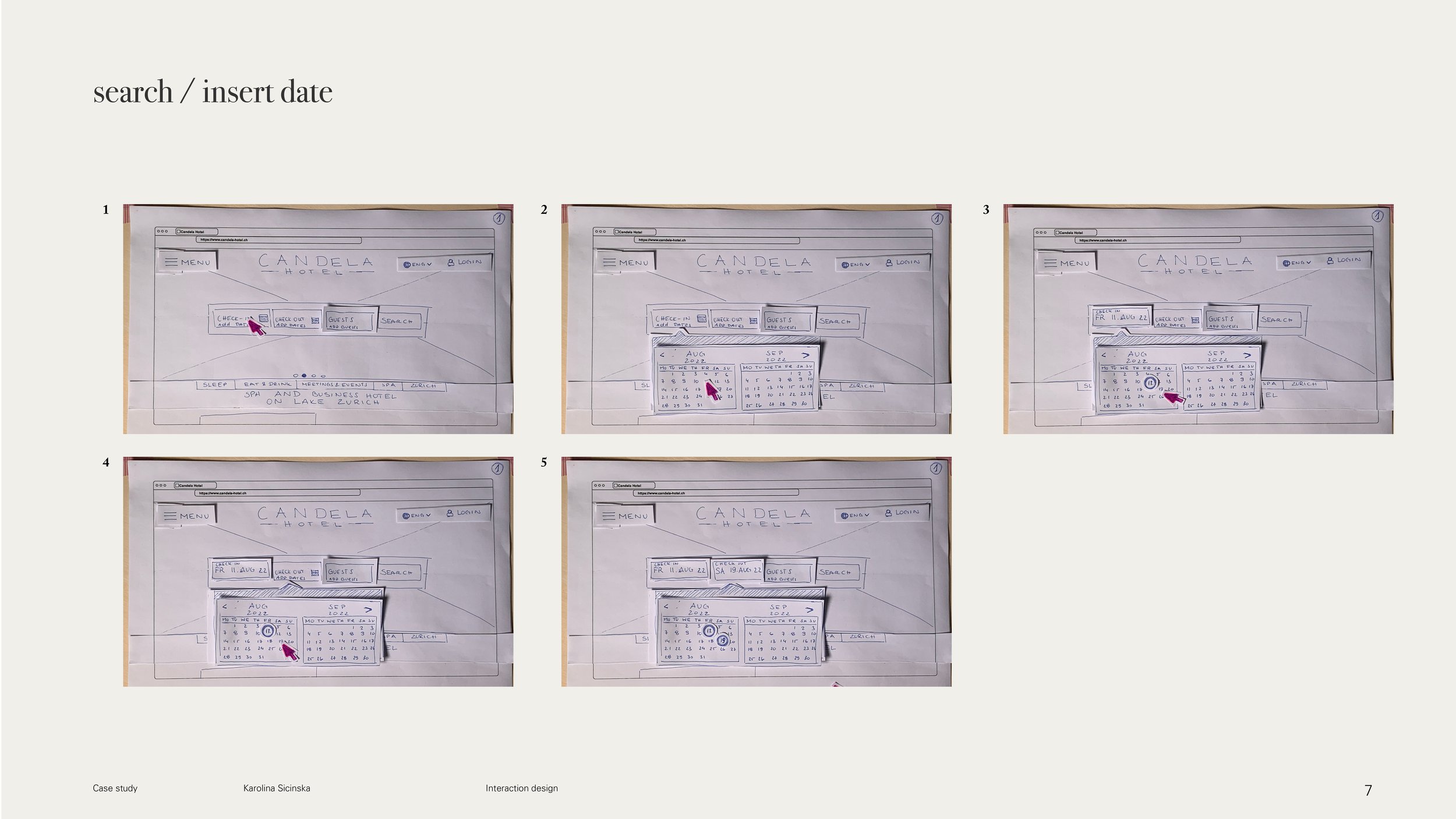
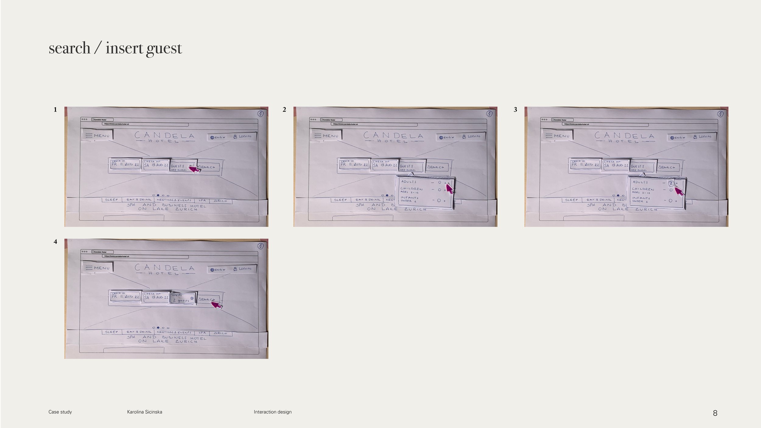
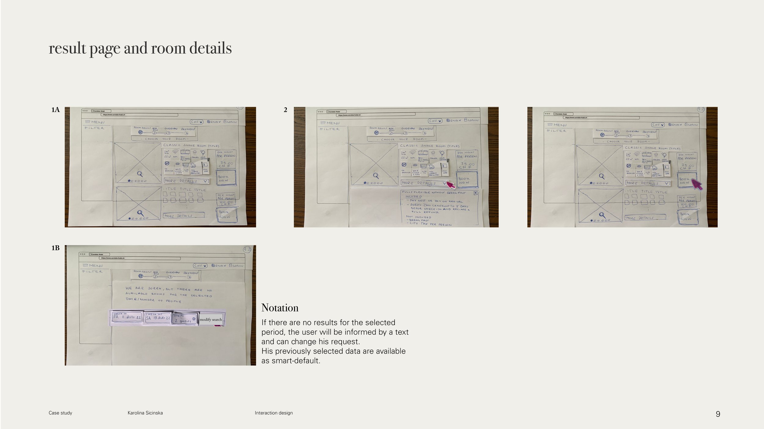
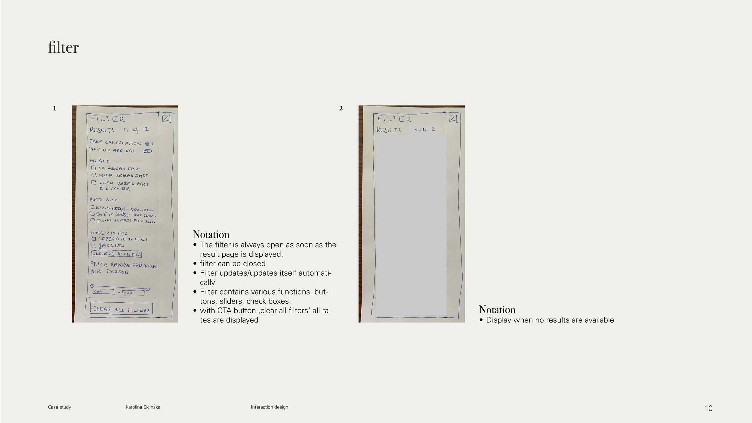
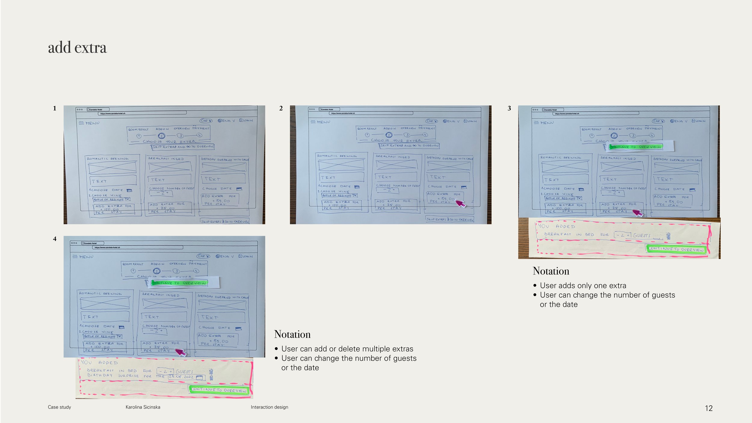
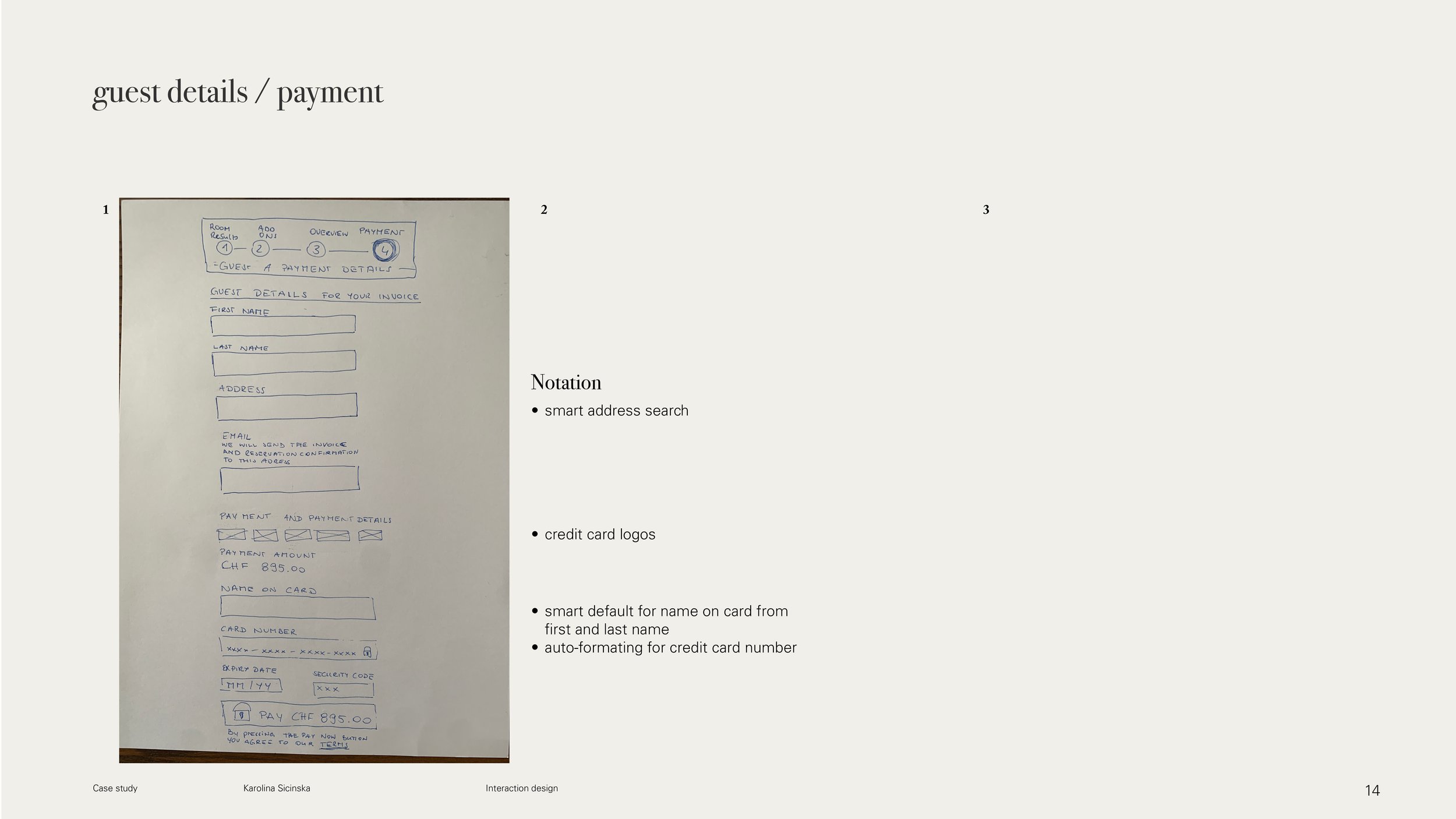
3.2. Sketches
From the data of the affinity diagram, the customer journey map and the user flow, I drafted sketches for the individual states.
4. Mid-fidelity prototype
The sketches served as a basis for creating a mid-fidelity prototype, with the help of which it is already possible to test the above concepts.
After the sketches, I immediately started to realise the prototype in Figma. Although I had found out in the online survey that European users like to use the desktop/PC/notebook for booking, I didn't know which screen size I should use as a starting point. Figma offers many different formats: MacBook Air 1280x832px, Mac Book Pro 14” 1512x982px, Mac Book Pro 16” 1728x1117px and Desktop 1440x1024.
I decided to take the smallest screen so that I could accommodate all the information and then make the site responsive for larger formats.
However, when creating the page, I realised that I had forgotten important CTAs, "back buttons" and thus had not pre-planned them in the screen, or that the dimension works differently on paper than in the prototype.
These are also the most important points that I would like to plan and consider better in the next prototype.
5. Validation - coming soon
I have tested my prototype through some users and the following points need to be changed:
6. Documentation - coming soon
After prototyping, validation and adaptation, the prototype is converted into wireframes, annotated and passed on to the developers. The prototype is then annotated (6) and passed on to the developers.
7. Conclusion
What I have taken away is that any task, no matter how big, can be broken down into bite-sized chunks so that the problems that arise can be understood.
I also realised that the design thinking method is neither a linear path nor a checklist to work through, but it is a good guide to where you are in the process of simplifying a product.
Of all the project sections, I found usability tests and their analysis/sorting in the affinity diagram particularly exciting and look forward to solving these tasks in the future.
And another topic that I haven't worked on in the project so far is "accessibility". I started reading about it during my course and would like to test and improve the accessibility of websites or apps in a next case study to better understand this UX area.
-
The creation of an online survey was the first of 11 projects in the design institute diploma, and it was one of 3 non-mandatory projects. In my opinion, it should give the participants an introduction to the topic of research and analysis of qualitative and quantitative data.
During the case study I read several other articles on the topic of surveys and UX research, which, in addition to my own observations, showed that surveys can become a source of error.My observation:
There was no recruitment screening. Everyone with a link was allowed to fill out the form. The distribution of the survey was monitored via the collector links of Survey Monkey. I distributed the link in social media posts on Facebook, Facebook Groups, LinkedIn and LinkedIn Groups.
There were not enough respondents for the results to be representative
Number of surveys answered vs. relevant content. The respondents from the SurveyMonkey Audience (purchased responses) were quicker in answering (1 1/3minutes on average) than the rest of the respondents and had a higher incidence of invalid or no responses when it came to comments or unstructured responses. They give us a high number of answered surveys, but without relevant content.
There is no opportunity to ask follow-up questions that provide deeper insight and perhaps unforeseen insights.
Incorrectly asked questions/ incorrectly labelled. I am not sure if the participants always consciously gave only one answer in question Q5, a multiple-choice question.
However, the most important observation for me is that I asked about an activity that is in the past. The user cannot remember all the details at all, but can only give his rough impression here. The peculiarities of the booking process can be better observed in a usability test. An additional research method would be a diary study. This allows an overview over a longer period of time. It would also allow us to observe the repeated return to the product via different omnichannels.
Further literature on online surveys and user experience -
Start the tasks differently: In my test manuscript, I followed the Design Institute template and gave the users exactly which link to use and thus the starting point. Instead, I could extend the task and give them as a task, show me how you book a hotel.
This way I can observe what the user does naturally, which pages they open first. I also see what the user learns during their search (terms and preferences that they didn't think of before, but that become important in the search process, like booking multiple rooms at the same time).
The disadvantage of such an approach is that I don't know the website the customer will land on and can't anticipate what problems they will have. I think that trained test leaders know how to react in such situations. Therefore, I can understand that the course assignment from UXDI was set in such a way that I, as a researcher, can prepare myself in the best possible way and thus keep the hurdle of doing a usability test myself as small as possible.
I was able to choose the pages that the user should test, which meant that I could also click through the website and learn where things are located, where there might be sticking points in the usage before the user sees them. On the other hand, it was easier to make links between my competitive benchmark and the usability test.
-
So far, I have also created competitive benchmarks for my graphic projects, but only with regard to the wishes of my own clients and not specifically with their users in mind.
When I developed this competitive benchmark, I compared different websites without having a checklist, but noted the features that stood out for me. For the next benchmark I would like to check the pages also with respect to accessibility and take over points of a heuristic evaluation or an expert review.
As described in "How to Conduct a Heuristic Evaluation" by Jakob Nielson (1.11.1994) , heuristics can help identify potential usability problems early in the design process and they are a quick and inexpensive tool compared to other methods that involve real users. "However, evaluation depends on the knowledge and expertise of the evaluators. Heuristic evaluation is based on assumptions about what constitutes `good` usability.Because heuristics are based on research findings, however, it is not a substitute for testing with real users. They are, as the name suggests, only guidelines and not rules set in stone." (Heuristic Evaluation: How to Conduct a Heuristic Evaluation by Euphemia Wong)
-
It is important to write Post-its informatively, which means to describe who did what and where. As a example: User did not see the CTA button “confirm” in the extras panel. This is the only way that team members and myself can remember what was meant by the post-it even weeks later.
Another point is that when I transfer post-its from the competitive benchmark, I also write or mark with a coloured post-it to which competitor the note comes from.
-
As mentioned above in the prototype, it is important to know at the beginning of the next project which screen size will be used so that all important information is visible.
It was only in a workshop with
Stéphanie Walter in October 2022 on “Information Architecture - How to Design Adaptive Components and Pages” (Delta CX - Concentric Conference) that I saw the workflow for creating reusable components and how to insert and "map" them into the different formats so that no important element is forgotten.What I really liked was working in a reduced "greyscale" colour scheme. It helped me to keep the information architecture in mind and not get distracted by colours, font types and colour transitions.
I have worked with Adobe xd before on other client projects, so I made a conscious decision to work with Figma this time. Especially the use of components simplified the work, be it the animation of the gallery slider or the programming of the form fields. I am already looking forward to further projects and to using the programme more deeply.
8. Sources
-
figure 1 - Moodboard Hotel
Photos for the moodboard are from unsplash.com and the following creators - for links please hover over the name
Chastity Cortijo
Edelle Bruton
Isaac Martin
Jean-Philippe Delber
Kam Idris
Nastuh Abootalebi 1
Nastuh Abootalebi 2
Ralph Ravi-Kayden
Reykjavik-Rendering-scaled
Spacejoy 1
Spacejoy 2
Spacejoy 3
Spacejoy 4
Spacejoy 5
Spacejoy 6
Spacejoy 7
Yann Maignan -
Background information
Design thinking process
Patton, Jeff (2015): User Mapping Story. O´Reilley (german edition), p.38)
Online surveys